
We Need to Talk About Millionaire
Take a knee, Who Wants to be a Millionaire. We need to have a chat and figure out what you’re trying to accomplish this season.
Who Wants to be a Millionaire is one year short of its 20th anniversary and seems to be going through a crisis as it leaves its teens and enters adulthood. The core of the game, for better or worse, is the same as its been for a few years. They redid the entire graphics package this season, though, without any real cohesion between anything that previously exists. At this moment we’ve got a format from one version, music from a different version, a set from a different version, and new graphics which don’t match up either. There’s so much to unpack.
Also we are aware all of this is petty but whatever…that’s what we do. We’re petty. This also comes from multiple people on our team who work in marketing, UX, and UI and who are just baffled at all these choices.
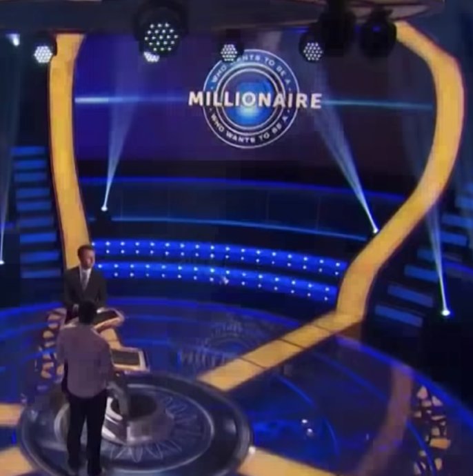
The show’s got a new logo. Fine. But, in one of those once-you-see-you-can’t-unsee moments, they’re now unable to center the title of the show in the logo, leaving it hanging off to the right because adjusting font kerning is very hard.
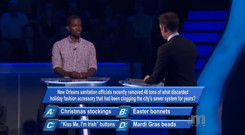
It’s very dark on the set so it looks like our contestant made it to a six figure question, congratulations! Oh, it’s for $1,000, never mind. We’ve also replaced Millionaire‘s old simple, functional, and iconic graphics for parallelograms with beveled edges. It’s truly 2011.
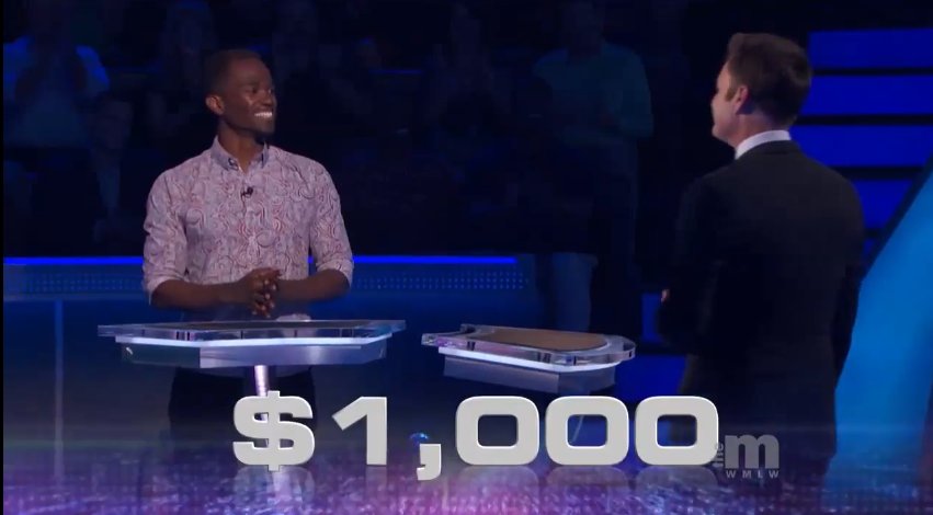 The graphics for money won are hysterically out of place and enormous. Also doesn’t match any of the other graphics used in the new package.
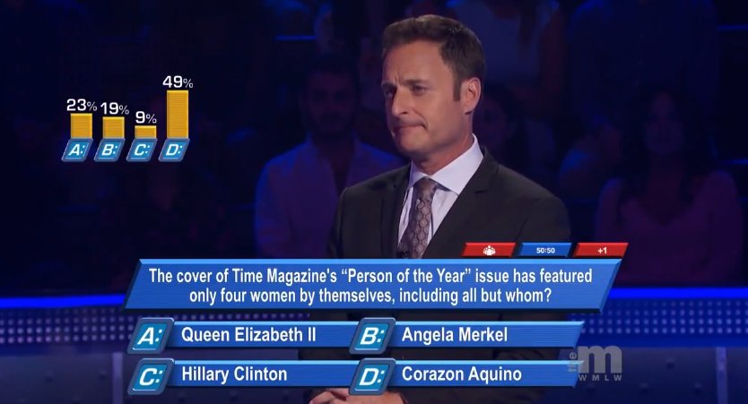 Chris’s expression is all of our expressions over everything they’ve done.
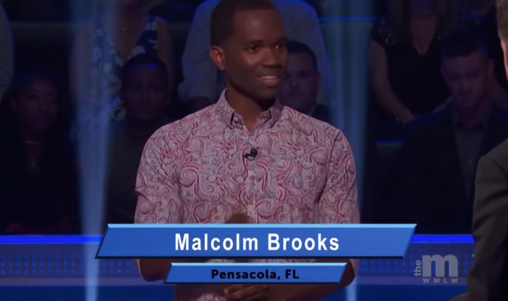 Inexplicably the graphics announcing players are using a completely different font, kerning, and color scheme.
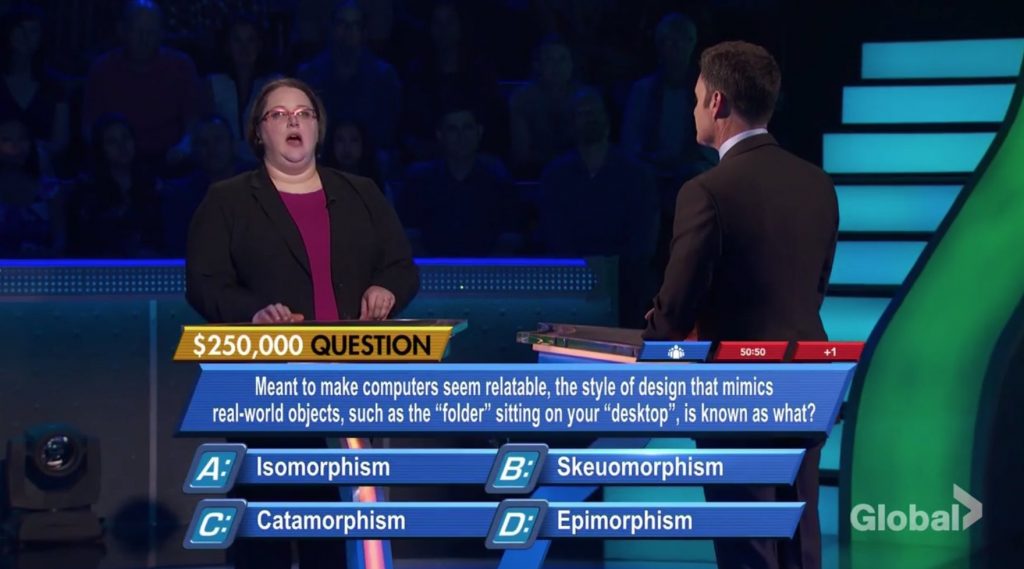
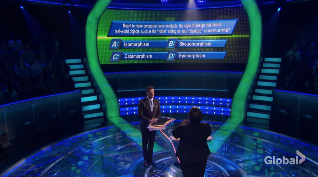 I suppose there’s also a reason they made the tense, nerve wracking parts of the game, like this $250,000 question, more bright and vivid than a $1,000 question.
We’re still big fans of Millionaire and only want the best for it. It’s been getting so much better then last few years and the production was starting to solidify. This season is a giant step back and nothing really flows together anymore. We’re not asking for absolute perfection. We’re just asking for slightly more effort than what looks like throwing stuff together in Photoshop an hour before taping. We say this because one of our readers did a pretty good job duplicating what they have now in less than a half hour, and it shouldn’t be this easy. Or if it is hire us to do your graphics.
Only about 30 minutes of work. pic.twitter.com/96zI2BXteO
— Josh Halbur (@apeminkie) September 10, 2018
